Alpha Brand Identity
Developing a brand identity system exploring typography, color, and visual language to create a consistent and recognizable brand.
Client
Alpha Consulting Solutions Co
Industry
Finance
Date
Oct 2019
Role
Graphic Designer / Logo Design
Scope
Logo redesign, concept exploration, symbol development, typography refinement, and color variation design
At a glance
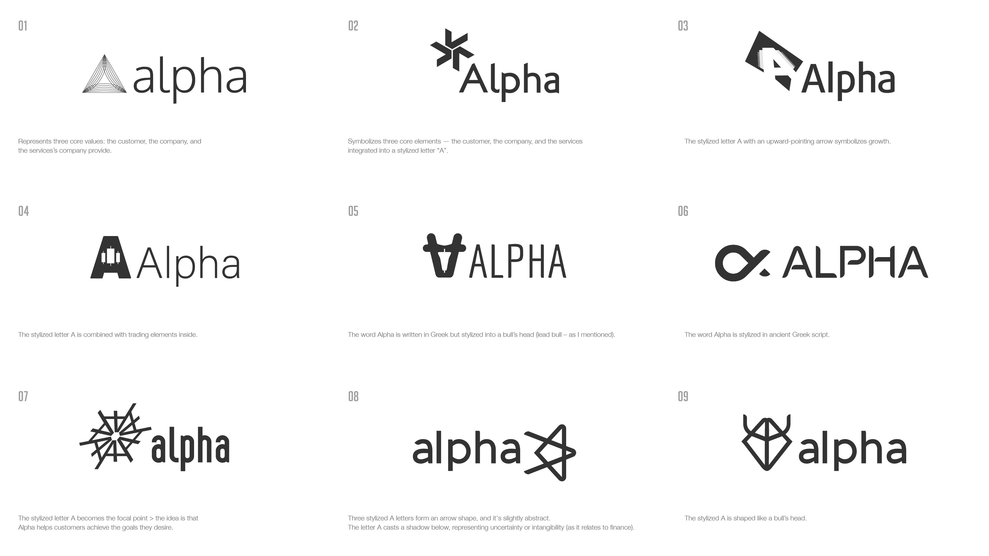
Redesigned the brand mark for a financial consulting company — translating business values of trust, growth, and clarity into a single scalable symbol built around the letter "A."
Overview
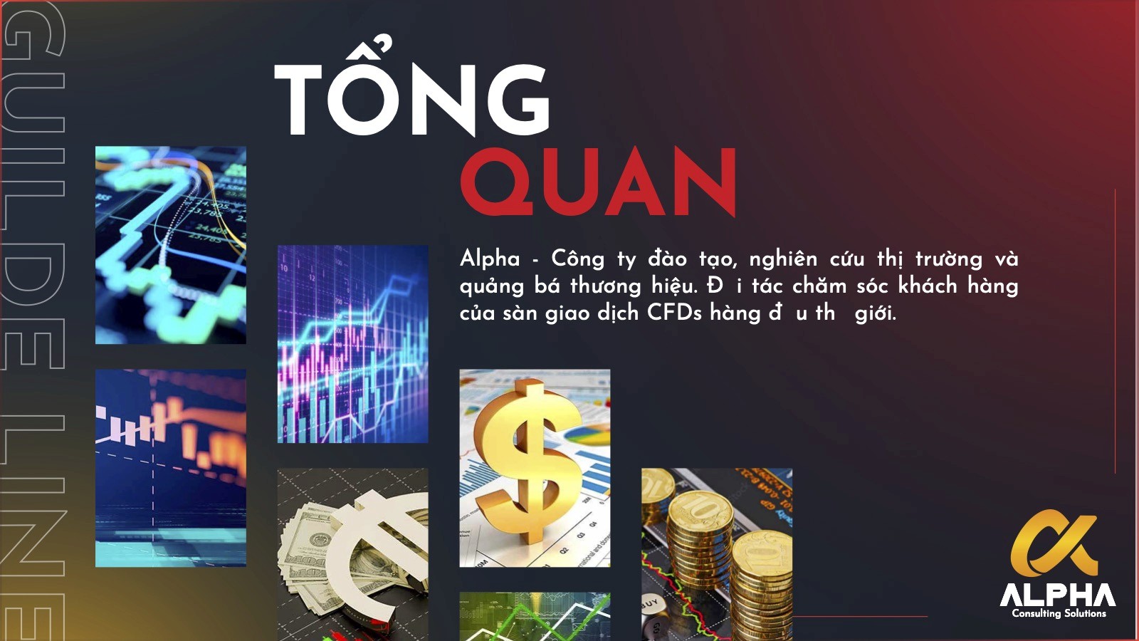
Alpha Consulting Solutions provides Forex and financial consulting services to individual investors, SMEs, and import-export businesses. Their existing logo no longer reflected the professionalism and trust the brand needed to communicate. The task was to create a simpler, more meaningful mark that could support both current services and future growth — primarily across digital touchpoints.
My Role
Reviewed the existing logo and identified communication gaps
Explored multiple concept directions around the letter "A"
Refined symbol, typography, and color variations for different digital usage contexts
Problems
The existing logo was misaligned with where the brand wanted to position itself.
Visual identity didn't communicate professionalism or trust — critical for a financial consulting audience
The mark lacked scalability and flexibility for digital-first usage
Method
Anchored all exploration in the letter "A" — simple, memorable, and directly tied to the brand name
Explored three symbolic directions: upward arrow (growth/momentum), trading-related form (industry relevance), and bull silhouette (strength + bullish market outlook)
Balanced abstraction with industry relevance — enough to suggest finance without locking the mark into one context
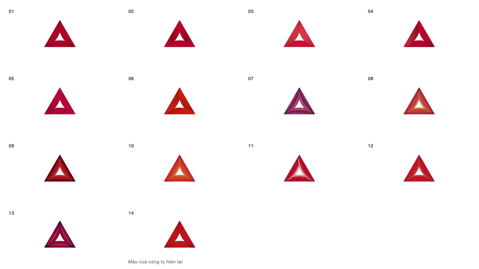
Developed color, monochrome, and text-lockup variations for different applications

Key Results
Final mark selected by client as aligned with both current positioning and future growth
Symbol carries layered meaning: leadership, forward momentum, and financial confidence
Scalable and clear across small digital sizes and multiple format variations
Reflection
Logo design isn't about adding references — it's about reduction. The strongest direction came from combining one recognizable structure, one layer of financial symbolism, and one clear usability requirement into a mark that felt both purposeful and durable.


