MBS Design System
Building a scalable design system to improve product consistency, streamline collaboration, and support faster development across teams.
Client
Military Bank Securities
Industry
Finance
Date
July 2023
Role
UX/UI Designer / Design System Building
Scope
Style guide foundation, design token structure, component standardization, documentation, and developer handoff support


At a glance
Built a design system from scratch that unified visual language across a securities platform and reduced friction between design and development.
Overview
The MBS Design System is the structural foundation for a product serving thousands of active users. What makes it interesting isn't the components — it's how the system changed the way two teams communicated: designers stopped rebuilding the same elements, developers stopped asking the same questions.
My role
I worked on building the style guide as a usable system for both designers and developers.
My responsibilities included:
identifying the missing foundations needed for a shared system
structuring visual foundations such as color and other reusable rules
standardizing commonly used components
documenting usage guidelines
helping create a shared language between design and development through clearer system logic
This work was done with support from teammates, but my focus was on turning fragmented UI patterns into a more unified and maintainable structure.
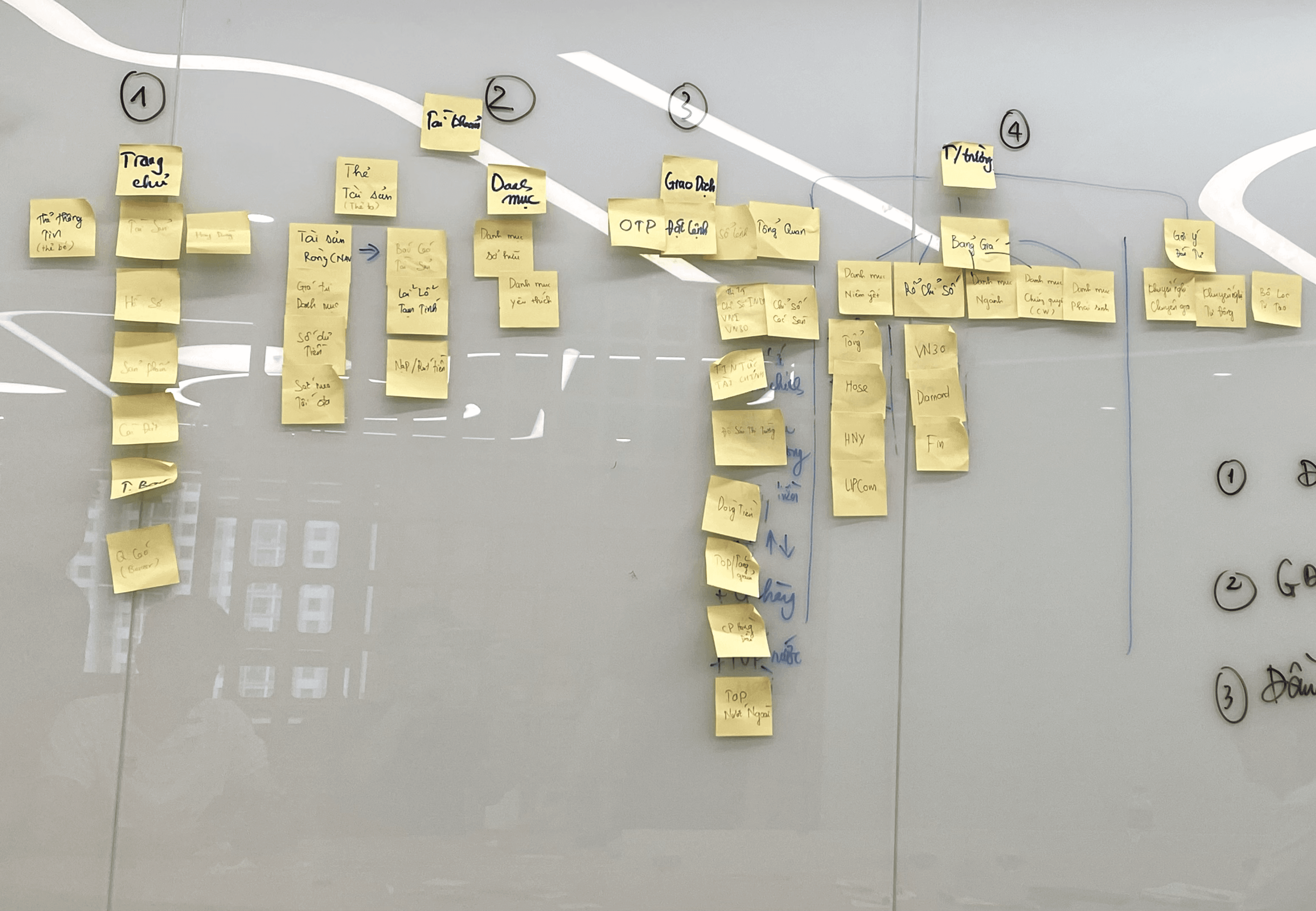
Before building any components, the team and I began by auditing the existing interface to identify inconsistencies and determine the foundational elements that needed to be prioritized. This step ensured that we didn't build a theoretical system that failed to reflect the actual product.
The team held a brainstorming session to evaluate the current app's Information Architecture (IA). Following this, we defined a new IA direction to align with the overall app redesign and the implementation of the new design system.


Problems
# | Problem |
1 | Same components looked different across screens — no single source of truth |
2 | Every handoff required repeated manual explanation on both sides |
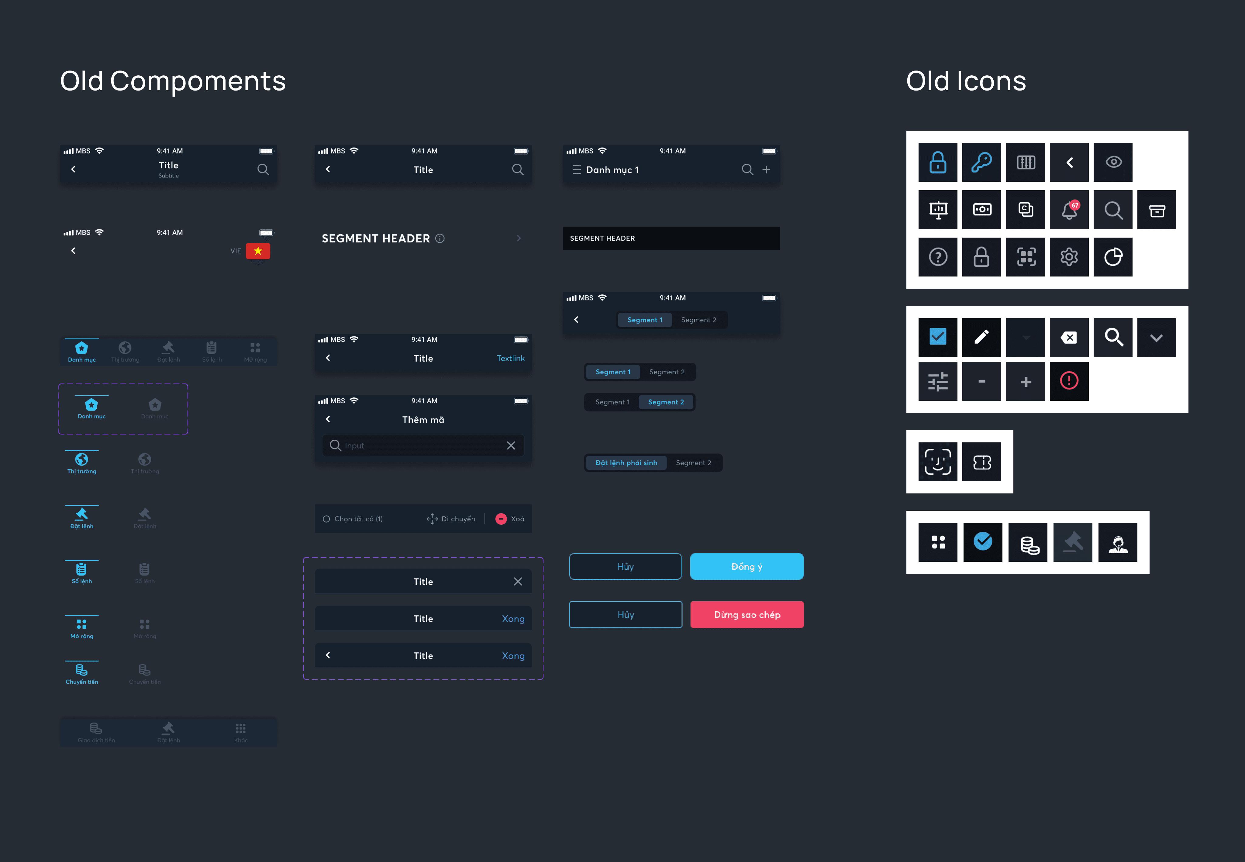
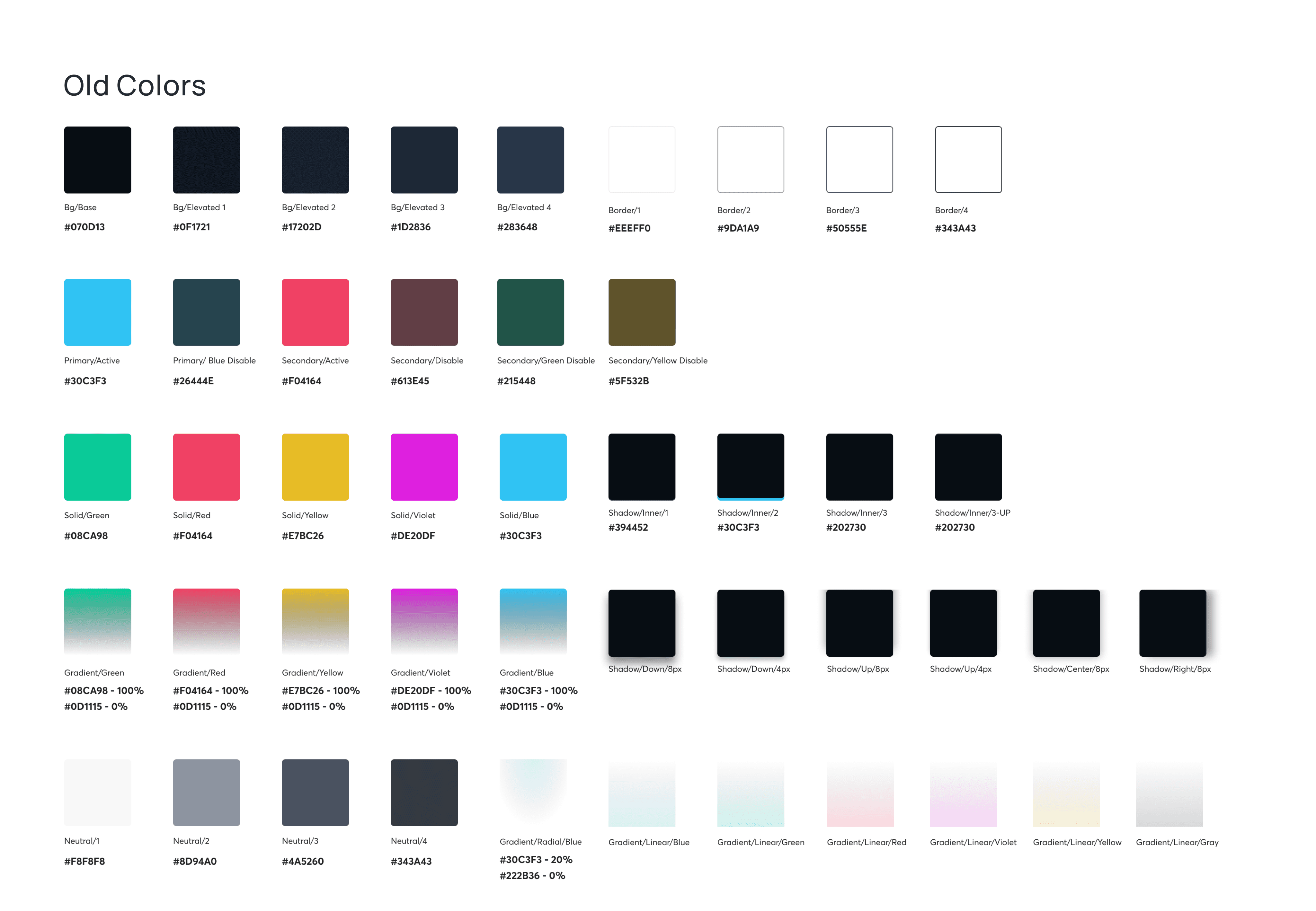
UI before establishing a design system: Components were designed from scratch for every screen, with no consistent rules in place. This resulted in identical components, such as buttons, having different corner radii or font sizes despite sharing the same dimensions.
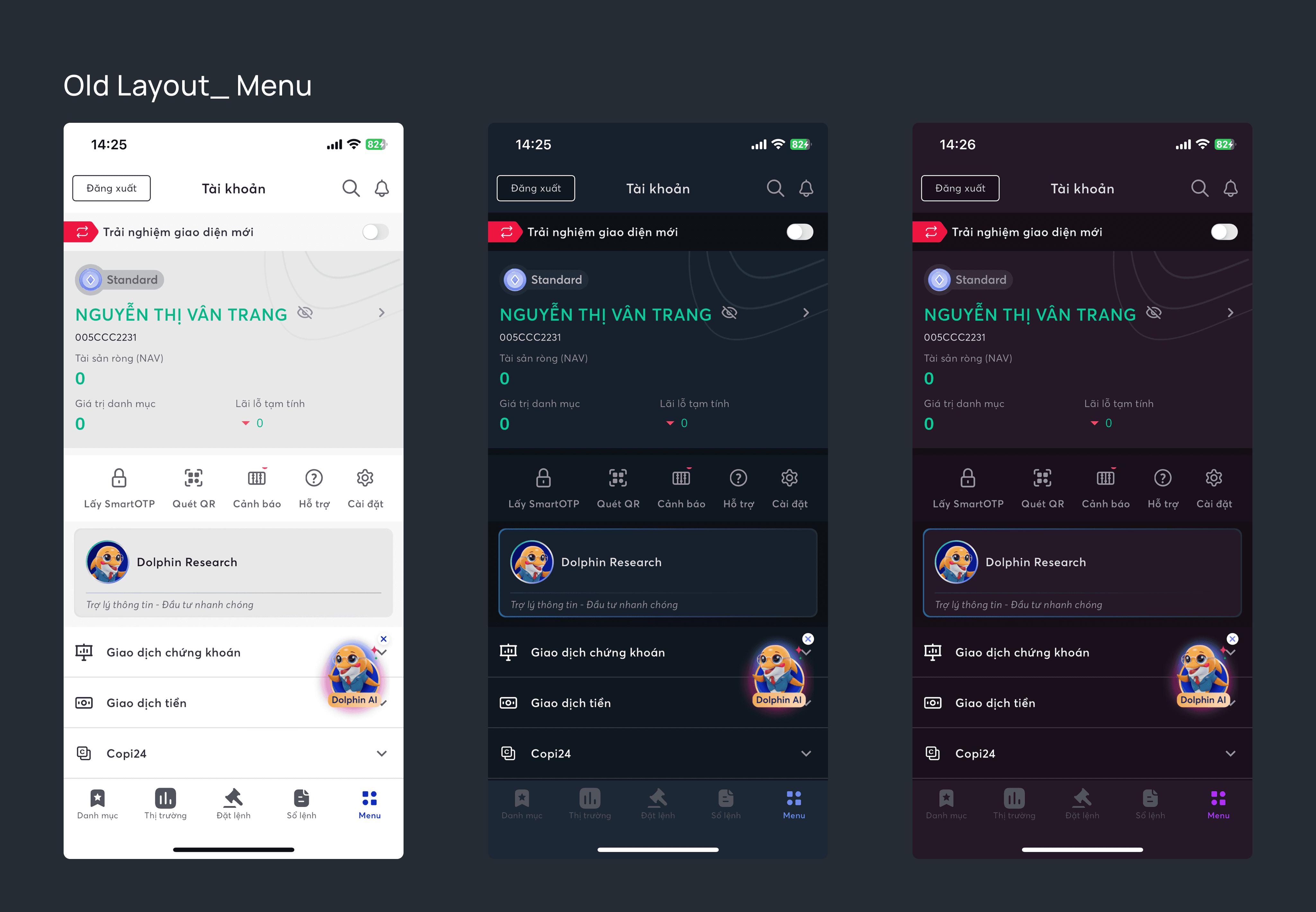
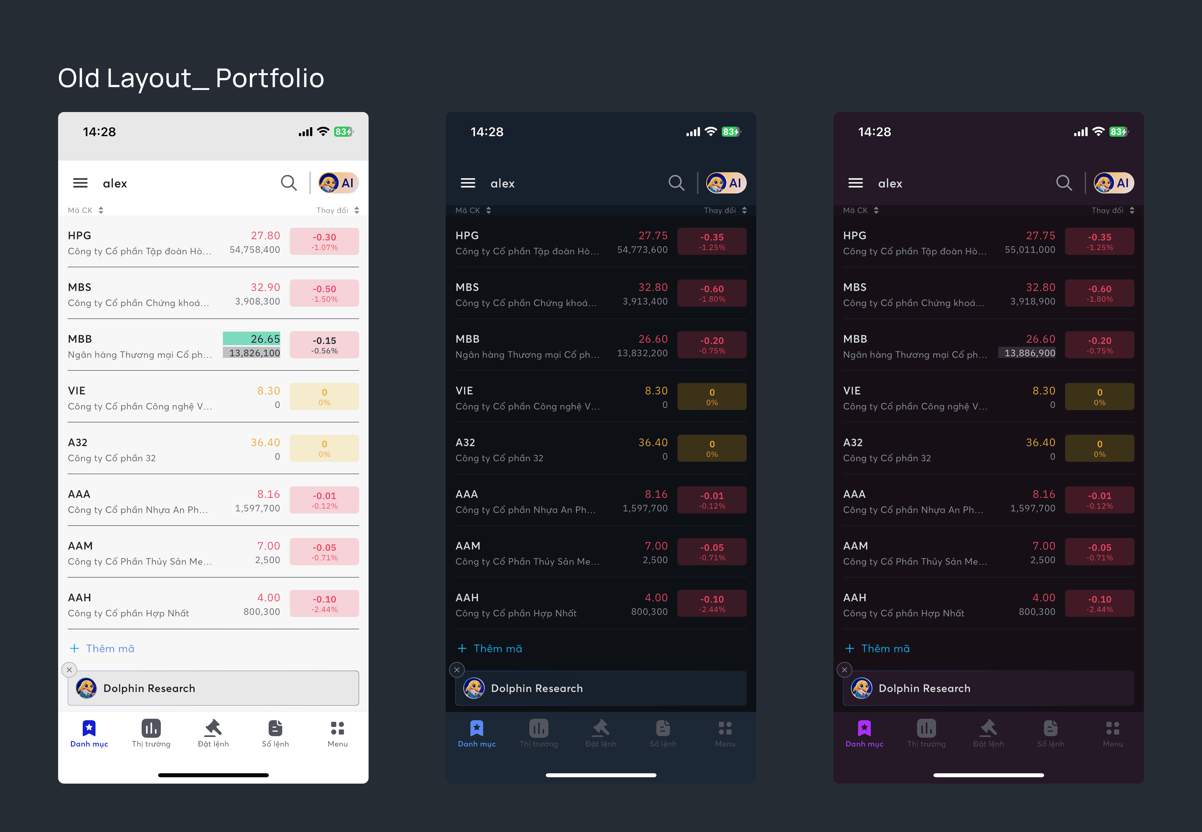
There was a clear disconnect between design and implementation, compounded by loose management of design tokens. The Light theme suffered from contrast issues compared to the Blue and Purple themes. Furthermore, some interfaces lacked high-fidelity designs, consisting only of wireframes that were then coded directly.
Method
Ran a full UI audit to surface inconsistencies across the product
Prioritized high-frequency components over theoretical completeness
Treated documentation as a communication tool — clear naming, explicit usage rules
Key Results
Outcome | Before | After |
Visual consistency | Fragmented across screens | Unified language across entire product |
Component reuse | Rebuilt from scratch each time | Shared library used by whole team |
Developer handoff | Required constant clarification | Self-explanatory — zero back-and-forth |
Feature development | Each feature reinvented patterns | Built on existing, documented patterns |
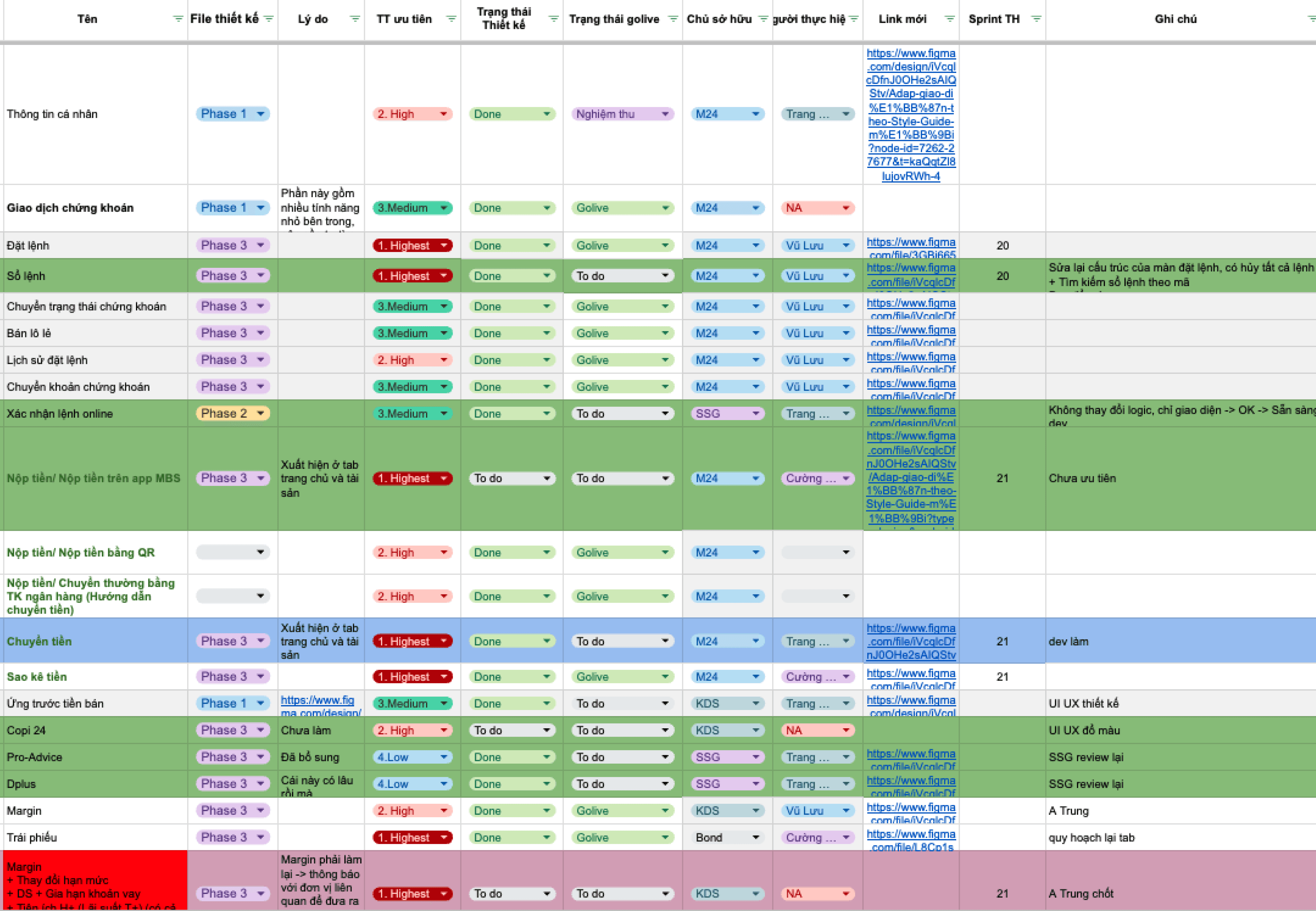
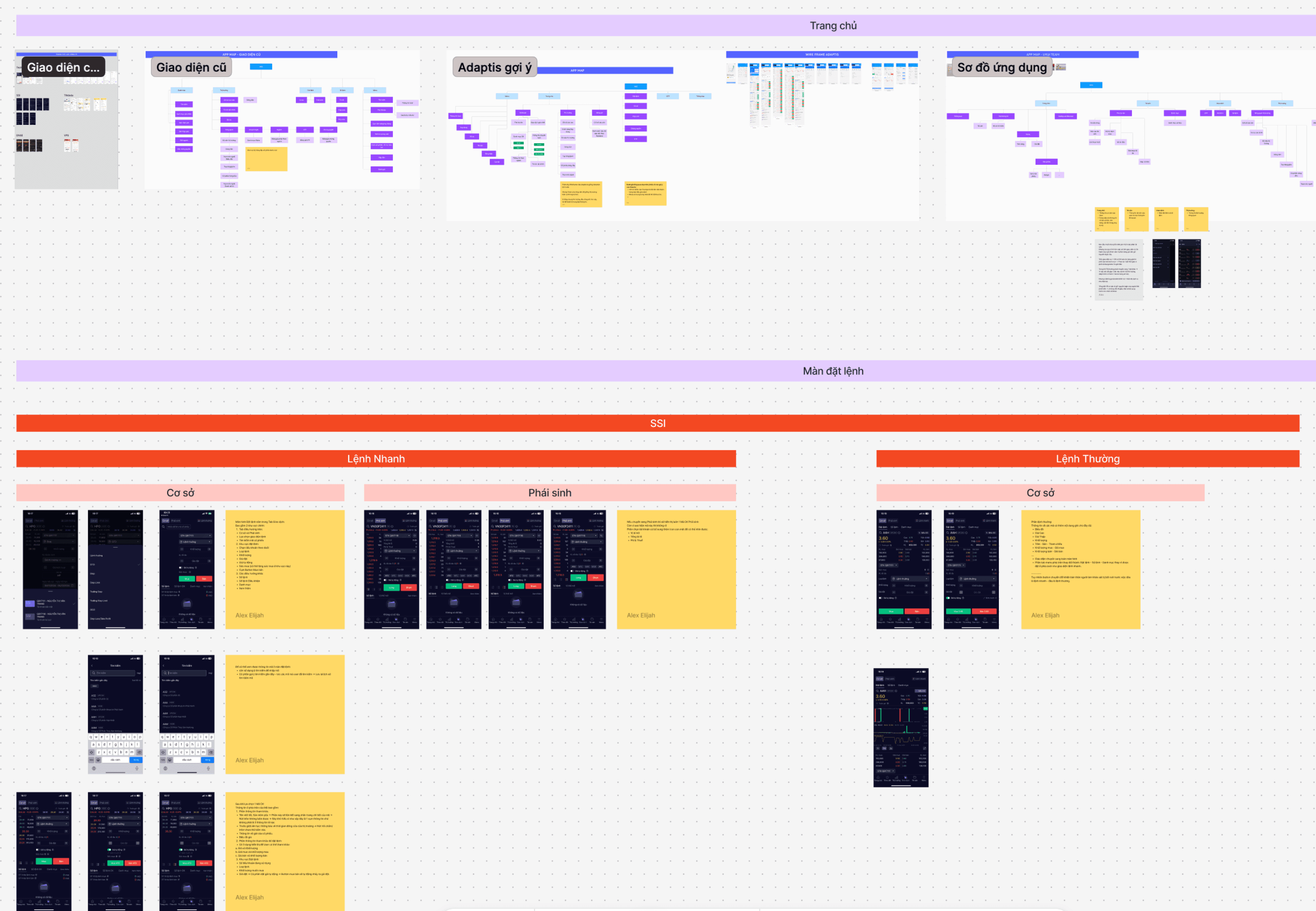
I audited and listed all existing screens based on user flows and features, then established a prioritization framework to identify which pages required immediate design attention.
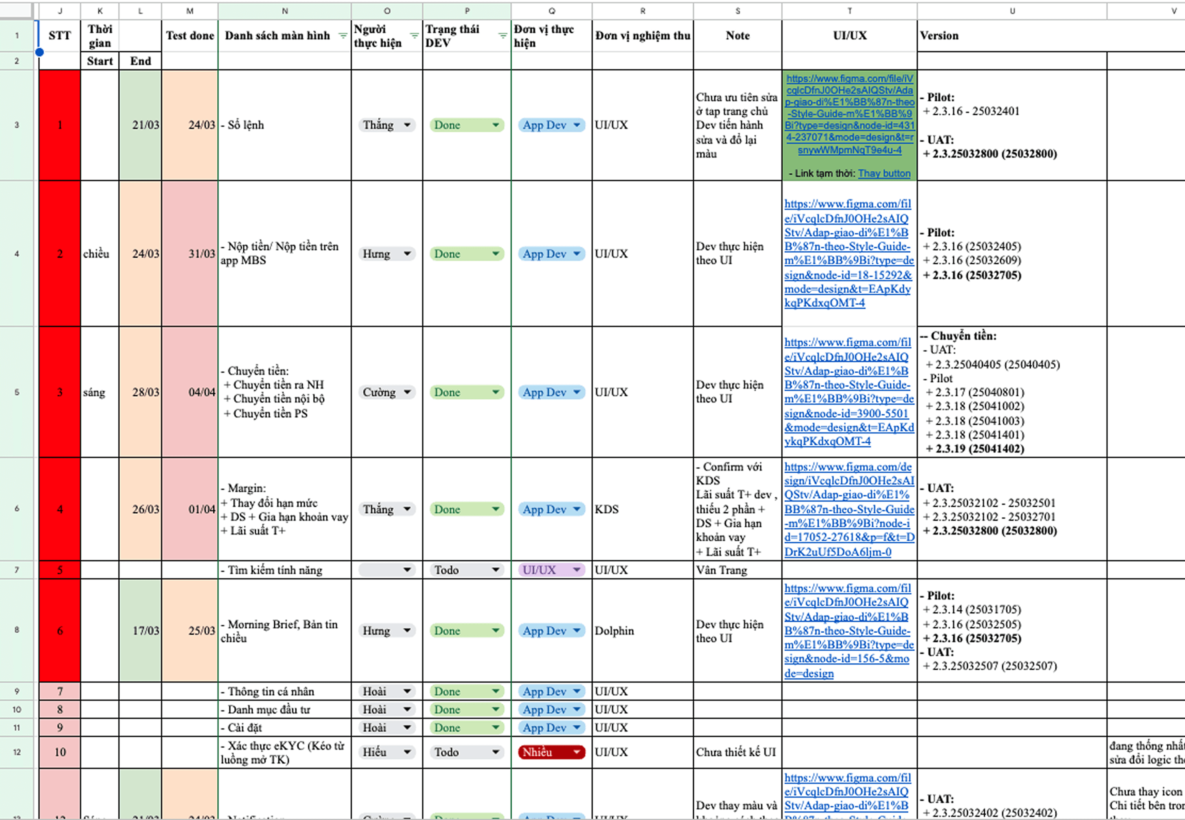
I collaborated with the development and QA teams to establish a comprehensive UI update schedule.
Reflection
A system no one adopts is just overhead. The hardest part was making it usable — clear naming, structured guidance, explicit rules. That's what turned a Figma library into actual infrastructure.


