Evergreen Brand Exploration
Exploring brand visuals through color, typography, and composition to create a calm, natural, and consistent visual identity.
Client
Visual Communication Academy
Industry
Education
Date
2020
Role
Design Mentor
Scope
Client brief interpretation, workshop facilitation, concept development, visual exploration, and website concept design

Overview
Evergreen is a plant business that wanted to refresh its identity and connect with a younger generation of customers. Traditionally, the company relied on word of mouth, walk-in visitors, and existing business relationships. The goal of this project was to explore a new brand direction and a more modern digital presence that could better speak to a changing audience.
This project was developed in a short-course setting at Visual Communication Academy. My role was not only to contribute as a designer, but also to guide students through a structured design-thinking process: from understanding the client request, to shaping ideas, developing visuals, and translating those ideas into a website concept.
My role
Design Mentor / UXUI & Graphic Design Lead
I guided the project process from brief interpretation to concept development.
My responsibilities included:
translating the client request into a clear design challenge
facilitating brand and audience thinking
helping shape visual direction
turning strategy into website structure and creative output
showing how design thinking can connect business goals with visual execution
The challenge
Evergreen recognized that the market for ornamental plants was shifting toward younger consumers, but its image and customer approach were still rooted in traditional channels. The challenge was to define a fresher, more relevant direction without losing the business’s credibility and expertise.
This meant answering three important questions:
How should the brand be repositioned for a younger audience?
What kind of visual language would make Evergreen feel more modern and approachable?
How could those ideas be translated into a website concept that felt both strategic and engaging?


The process
Rather than jumping directly into visual design, I structured the project around a design-thinking workflow that helped connect business intent with creative decisions.
1. Understanding the brief
We started by identifying the company’s business goals, target audience, and desired brand shift. In a short workshop format, we focused on quick alignment rather than perfect answers, using the session to build enough strategic clarity to move into concept development.
2. Defining the brand idea
From the workshop, we developed a set of core brand attributes and a positioning idea for Evergreen. The emerging direction framed the brand as “the plant care specialist”, with a personality that felt professional, convenient, and modern. This became the foundation for both content and design decisions.
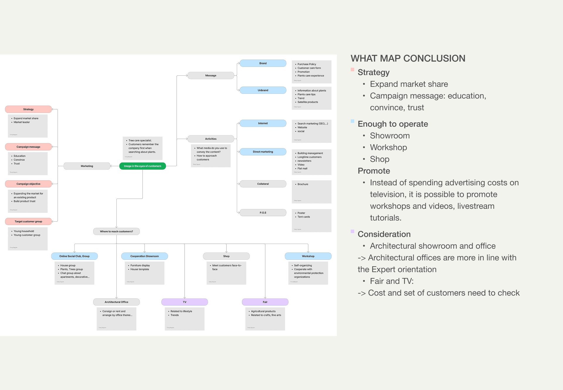
3. Structuring thinking with the “What map”
The “What map” was used to define what the brand should talk about, how it creates impact, what makes it different, and where it can connect with plant lovers. This step helped turn abstract brand thinking into strategic communication directions.
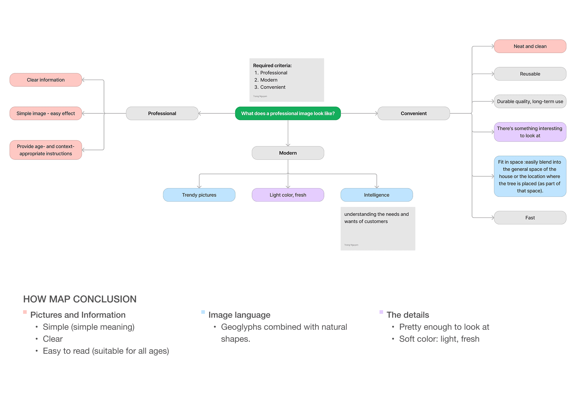
4. Translating strategy into design with the “How map”
The “How map” focused on expressing the brand personality visually. We used it to define how ideas like professionalism, convenience, and modernity should appear in layout, imagery, content presentation, icons, and color. This step created a bridge between brand meaning and interface design decisions.
5. Building audience stories
To make the concept more relevant, I guided the development of customer stories based on assumptions, interviews, and observation. These stories helped frame how different users might live with plants, care for them, and emotionally relate to them. Instead of treating target groups as abstract demographics, we translated them into more human lifestyle-based narratives.
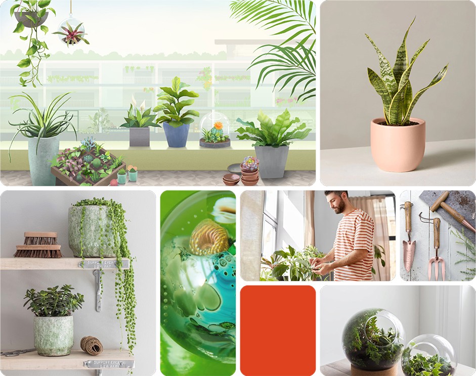
6. Developing the visual direction
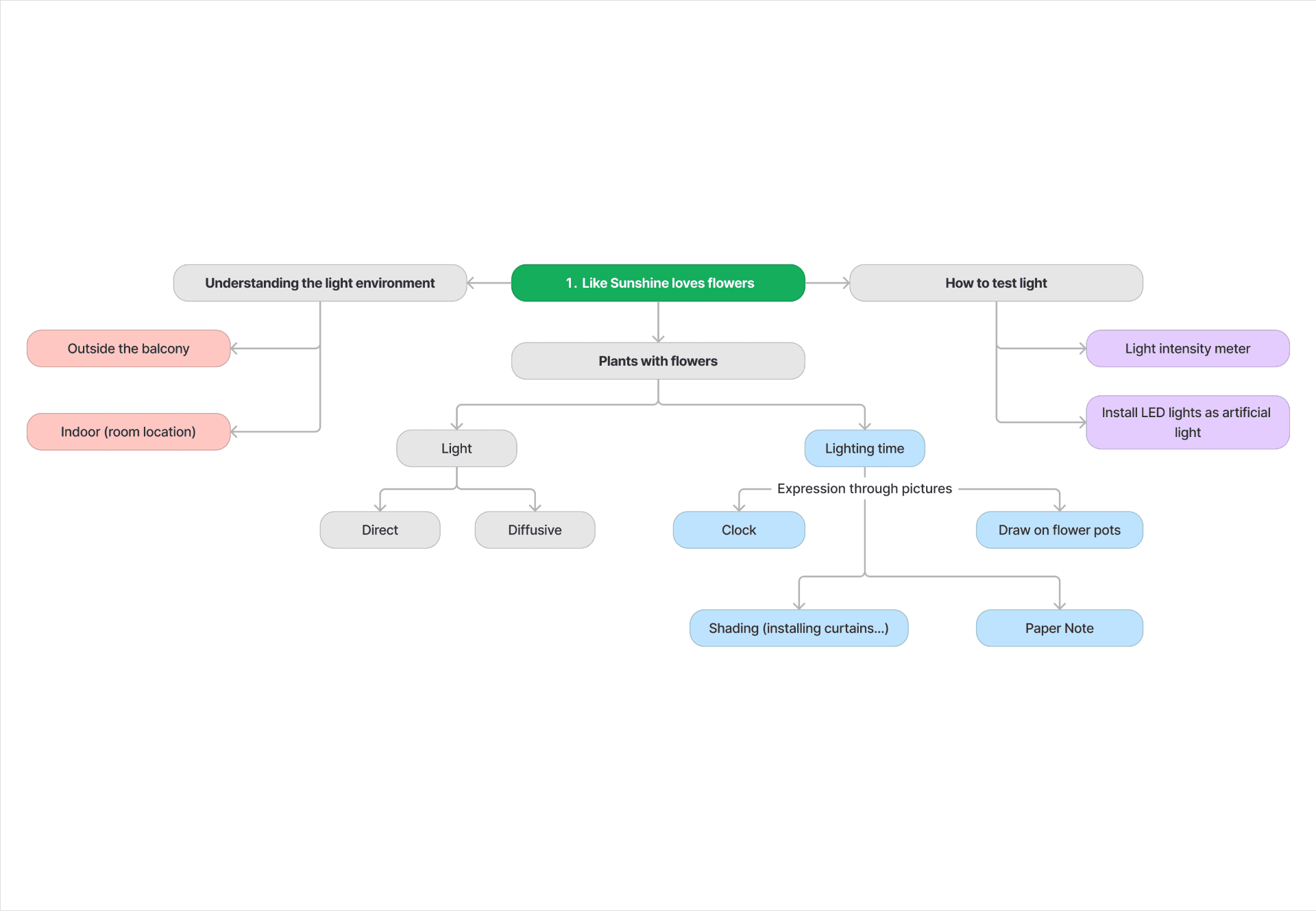
Using the tagline, brand attributes, and audience stories, I analyzed the visual direction and discussed it with collaborators to shape the image style for the brand. This phase focused on turning strategy into something visible: illustration ideas, mood, composition, and the tone of the future website experience.
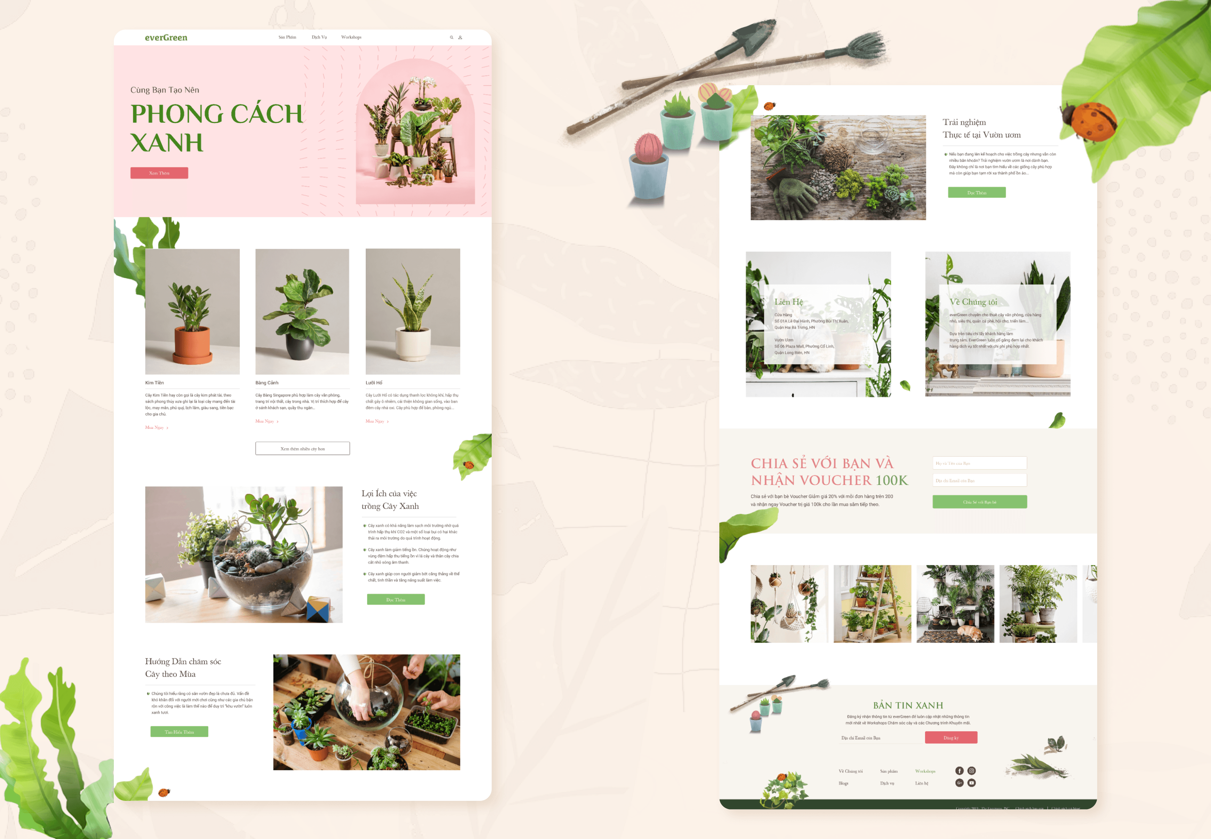
7. Designing the website concept
The final website concept was the result of that full chain of thinking. Rather than designing screens in isolation, the website was built as an extension of the brand idea: a more modern, structured, and audience-aware experience for Evergreen.
What this project demonstrates
This project is less about a single polished final interface and more about showing how I use design thinking to guide a process from ambiguity to direction.
It demonstrates my ability to:
interpret a client request and define the real design problem
lead early-stage ideation and strategic framing
connect brand thinking with audience understanding
translate visual direction into digital design concepts
teach and structure a creative workflow in a practical way
Reflection
One of the most valuable parts of this project was showing that strong design outcomes do not begin with screens. They begin with clearer thinking.
For me, Evergreen reinforced the importance of using structured exercises not as theory, but as tools to move from unclear requests toward aligned decisions. It also highlighted how mentoring and design practice can support each other: teaching the process made the logic behind each creative decision more deliberate and easier to communicate.
If I developed this further
validate audience assumptions with more real user interviews
turn customer stories into clearer site architecture
test navigation and content priorities with potential users
refine the website concept into a higher-fidelity responsive experience