Posters for VCA Color Short Course
Developing a promotional poster from Pantone-based color thinking to final visual execution
Client
Visual Communication Academy
Industry
Education
Date
January 2019
Role
Visual Designer / Teaching Assistant
Scope
Pantone color analysis, idea development, composition building, background design, creative collaboration, and promotional poster design
This project was created to promote VCA’s Color Short Course on Facebook. As a teaching assistant, I worked closely with the course instructor and creative director, Vicky Vu, as well as an illustrator, to develop a poster that could both attract design learners and reflect the educational focus of the course.
What made this project especially meaningful was that it was not only about producing a final poster. It was also about developing the idea behind the poster through a structured process: defining the message, exploring visual directions, testing character-based routes, and building a final composition that could support the selected Pantone color logic.
The challenge was to create a poster that could promote the course effectively while also embodying the spirit of color education.
This required more than making something visually attractive. The poster needed to:
communicate the course theme clearly
appeal to designers on Facebook
express Pantone-based color thinking in an engaging way
move from a rough idea into a coherent final composition through collaboration
Unlike a recolor exercise where composition already exists, this project required the visual idea to be developed step by step. The background composition had to be created from scratch so the chosen color system could work naturally with the poster.
My role focused on turning creative direction into a workable visual process.
I was responsible for:
analyzing the Pantone palette and its proportional logic
helping shape the concept direction with the creative director
developing the background and overall composition
supporting the transition from early visual routes to a final poster
integrating illustrated elements into a cohesive final design
The dog and cat illustrations were developed with the illustrator, while I was responsible for building the background structure and ensuring the composition could support both the characters and the intended color direction.
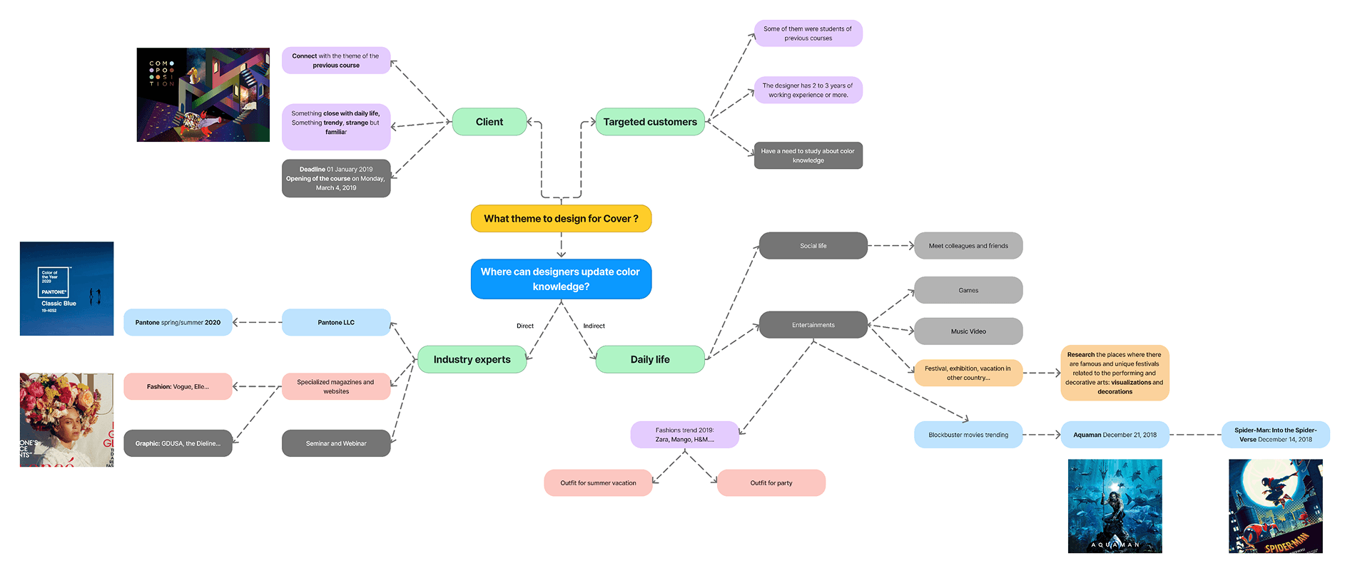
1. Framing the idea
We began by identifying what kind of visual theme could resonate with the target audience and support the course message. This stage was about defining what the poster should communicate and how it should feel. Rather than jumping directly into execution, we first clarified the idea behind the campaign.
2. Exploring the concept through maps
To structure the ideation process, we used tools such as the What map and How map. These helped us define:
what message the poster should carry
what kind of emotional and visual tone would suit the course
how the idea could be translated into a promotional visual language
This part is important because it shows that the final poster was not designed randomly. It was built from a clearer concept foundation.
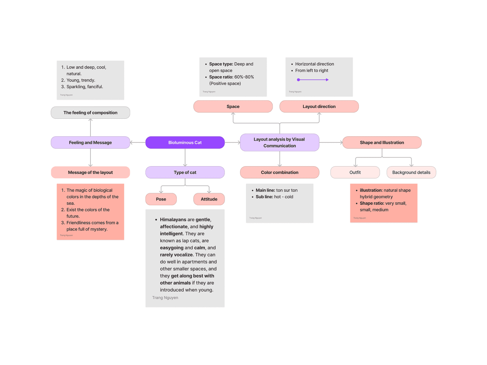
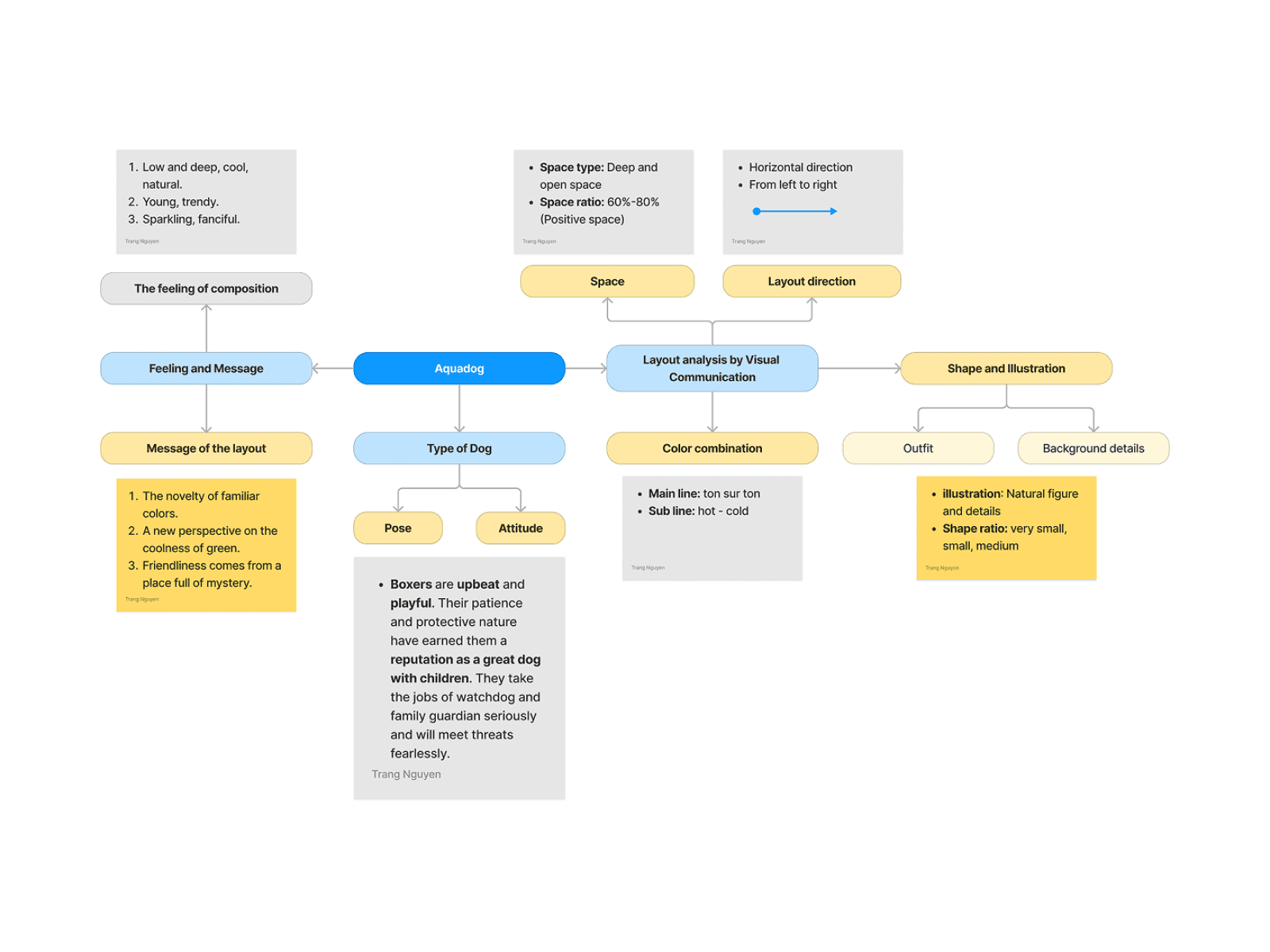
3. Developing visual routes
From there, the idea was explored through different visual directions, including the Cat and Dog routes shown in the process. These routes allowed us to test how different character-led approaches could express the course energy and attract attention.
At this stage, the process was less about finishing the poster and more about asking:
which route feels more memorable?
which route works better with the Pantone palette?
which direction gives us a stronger visual identity for promotion?
4. Building the composition
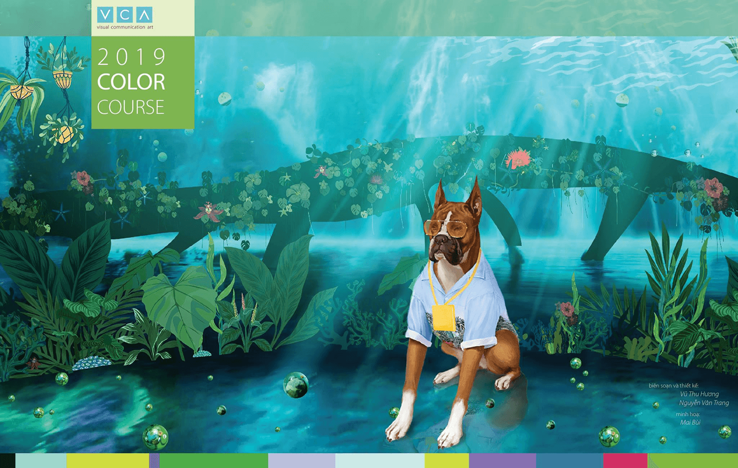
Once the idea direction became clearer, I developed the background composition to support the chosen route.
This was a key part of my contribution. Unlike projects based on an existing artwork, this composition had to be built from scratch. I used the color logic of the Pantone palette to shape the layout, rhythm, layering, and emphasis of the background, making sure it could hold the illustrations and still feel visually balanced.
5. Synthesizing the final image
After the explorations, the design moved into image synthesis, where the selected direction was refined into a more unified poster system. This step brought together:
the course message
the character illustration
the background composition
the Pantone-driven color structure
This was the stage where separate parts became one coherent promotional image.
6. Final execution
The final result was a promotional poster that balanced education and marketing. It worked as a course advertisement, but it also reflected the structured thinking behind color application, composition, and collaborative visual development.
The project resulted in a promotional poster for VCA’s Color Short Course that was not only visually engaging, but also grounded in a clear development process.
More importantly, it demonstrated my ability to:
develop a visual idea from concept to execution
work within a collaborative creative process
build custom compositions that support color systems
translate educational content into promotional design
Reflection
This project reinforced for me that strong visual work is rarely the result of a single step. It comes from developing an idea carefully, testing different routes, and building a structure that allows the final image to feel intentional.
For this project, the most valuable part was not only the final poster, but the process of turning an abstract direction into a finished promotional piece through analysis, exploration, and collaboration.