Alpha Brand Identity
Developing a brand identity system exploring typography, color, and visual language to create a consistent and recognizable brand.
Client
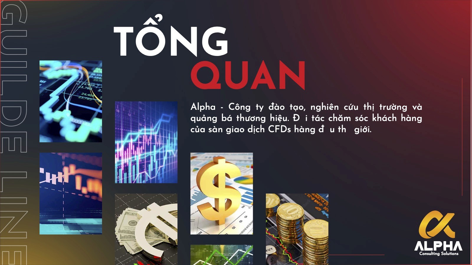
Alpha Consulting Solutions Co
Industry
Finance
Date
Oct 2019
Role
Graphic Designer / Logo Design
Scope
Logo redesign, concept exploration, symbol development, typography refinement, and color variation design
This project focused on redesigning the logo for Alpha Consulting Solutions Co, a company providing consulting services in finance and trading. The business supports clients through current-state analysis, strategic recommendations, implementation support, and performance monitoring. Its audience includes individual investors, SMEs involved in import-export, and people looking for more structured guidance in Forex-related decision-making.
The company’s existing logo no longer reflected the level of professionalism, clarity, and trust the brand wanted to communicate. My task was to redesign the logo into a simpler and more meaningful visual mark that could better support the company’s services and future growth.
The challenge was to create a logo that felt more aligned with the company’s positioning in the financial consulting space.
According to the brief, the new logo needed to communicate:
the connection between the company and its customers
the value delivered through its services
a sense of simplicity, elegance, trust, and growth
The logo would be used mainly in online communication materials, so it also needed to remain clear, scalable, and recognizable across digital touchpoints. The existing project page states this need directly and frames the redesign around both aesthetic improvement and stronger communication.
My role was to translate the company’s business values into a more effective visual identity through logo redesign.
My responsibilities included:
reviewing the old logo and identifying its limitations
interpreting the brand’s service positioning and audience needs
exploring multiple concept directions around the letter “A”
refining symbol and typography options
developing color and text variations for different usage contexts
The goal was not simply to make the mark look more modern, but to create a logo that could carry stronger meaning and remain usable as the company grew.
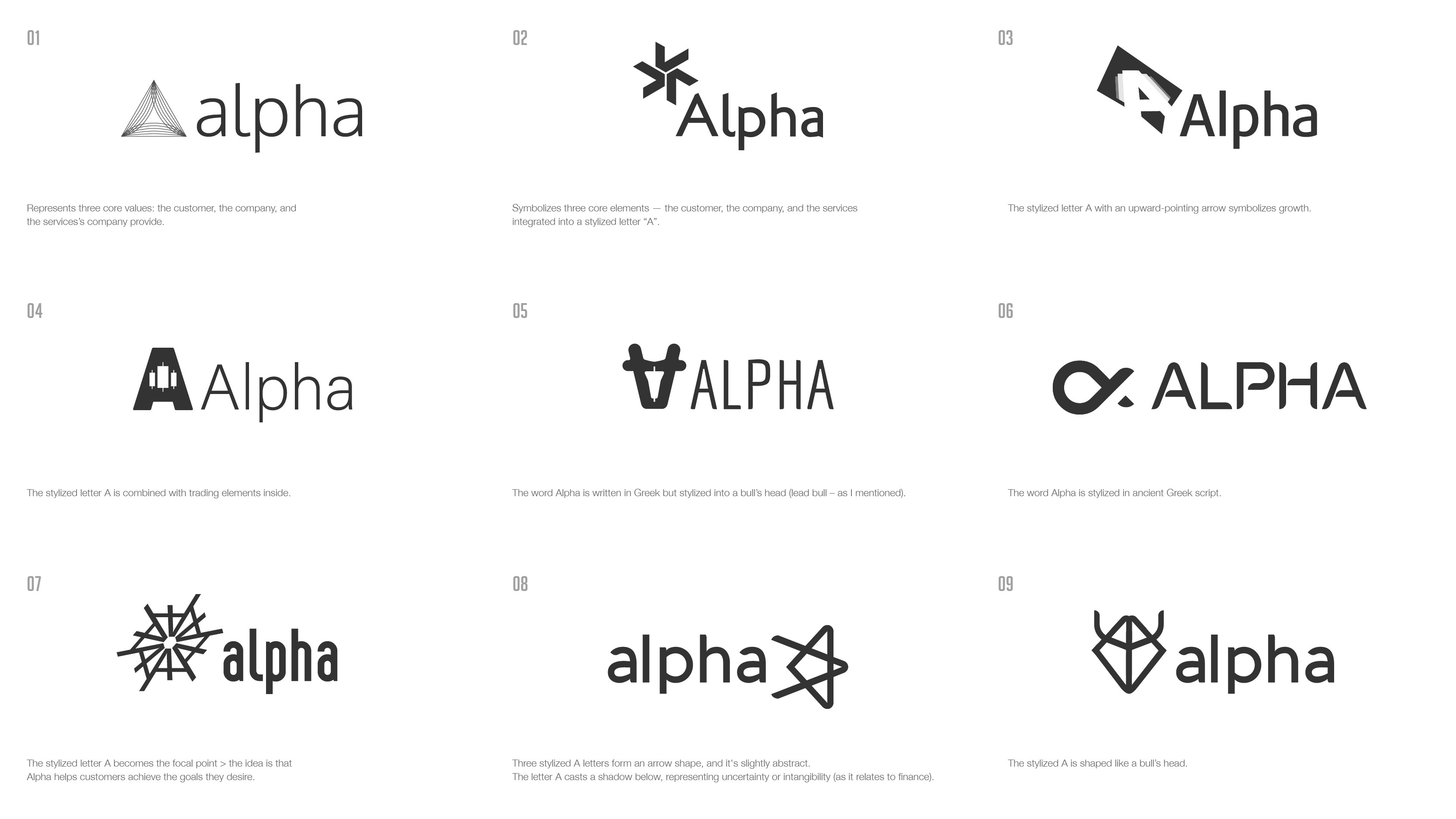
1. Starting from the letter “A”
The redesign centered around the letter A, which directly connects to the company name Alpha. This became the core structure for the new logo system and provided a clear starting point for symbolic exploration. The current page explicitly describes the new logo as being centered around a stylized “A.”
Using the first letter of the brand name helped keep the identity simple and memorable, while also creating room to embed broader business meaning into the form.
2. Exploring growth and forward movement
One of the key visual directions was turning the “A” into an upward-pointing shape, similar to an arrow. This direction was used to represent:
growth
ambition
progress
forward momentum
These ideas are especially relevant for a business operating in finance and trading, where clients often associate value with clarity, direction, and measurable improvement. The existing page already links this form to growth and financial momentum.
3. Referencing the financial context
Another design consideration was how to subtly connect the logo to Alpha’s industry.
Within the stylized “A,” trading-related associations were explored to reflect the company’s services in Forex and financial consulting. Rather than making the identity overly literal, the approach aimed for a balance between abstraction and relevance — enough to suggest the industry without limiting the logo’s long-term flexibility. The current project page describes this as integrating trading-related elements within the shape.
4. Building meaning through symbolism
A further concept direction drew inspiration from the Greek letter Alpha (Α) and transformed the letterform into something that could also suggest the silhouette of a bull’s head.
This added another layer of meaning:
Alpha as leadership or first position
the bull as a symbol of strength and optimistic market outlook
the combined form as a mark of confidence and direction in the financial sector
This symbolic layer gave the identity more depth while still keeping the final form minimal. The current page already connects this route to leadership, strength, and a bullish financial outlook.
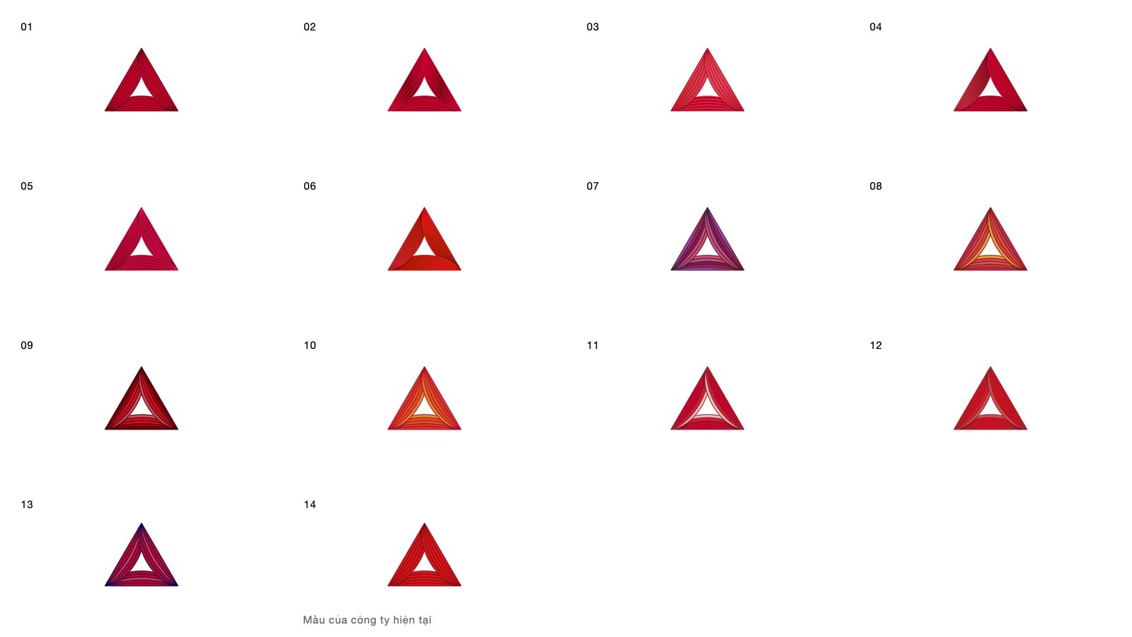
5. Keeping the mark simple and scalable
Because the logo was intended mainly for online communication, simplicity and usability were essential.
I developed the design so it could:
remain clear at small sizes
work across different digital applications
adapt into monochrome, color, and text-lockup variations
stay relevant as the company expands its services over time
This is reinforced by the visual sections already shown on the page, including color versions, text versions, and the final logo selection.
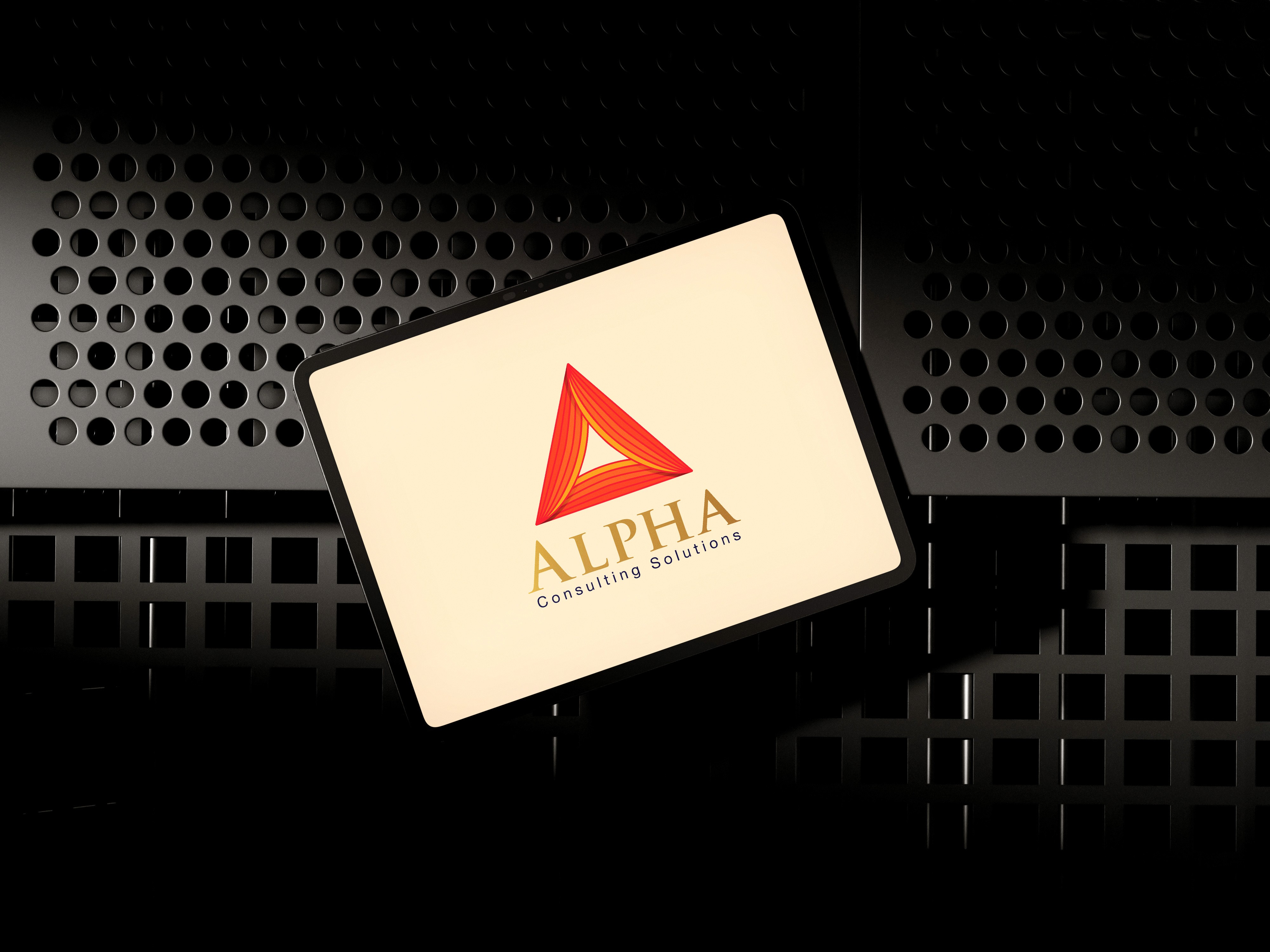
The final logo selected by the client features a stylized triangular A that reflects the core values the company wants to express. According to the current case page, the client chose this version because it felt suitable not only for the company’s current positioning, but also for its future growth and broader service expansion.
The redesigned mark created a cleaner and more intentional visual identity by:
improving the logo’s clarity and professionalism
connecting the brand more directly to ideas of trust and growth
giving the company a more scalable symbol for digital communication
offering a stronger long-term foundation than the previous logo
What this project demonstrates
This project demonstrates my ability to:
translate abstract business values into a concise visual symbol
develop multiple logo directions around a central brand idea
balance industry relevance with long-term flexibility
refine a mark for digital-first brand communication
It also shows that I can move beyond pure aesthetics and think about how a logo should function as a durable business asset.
Reflection
What I found most valuable in this project was the challenge of simplifying meaning.
In logo design, the goal is not to add more references, but to reduce a business into its clearest possible signal. For Alpha, the strongest direction came from combining recognizable structure, financial symbolism, and long-term usability into a mark that felt both purposeful and scalable.